Womens Resource Center Identity
You don’t have to face this alone.
The approach:
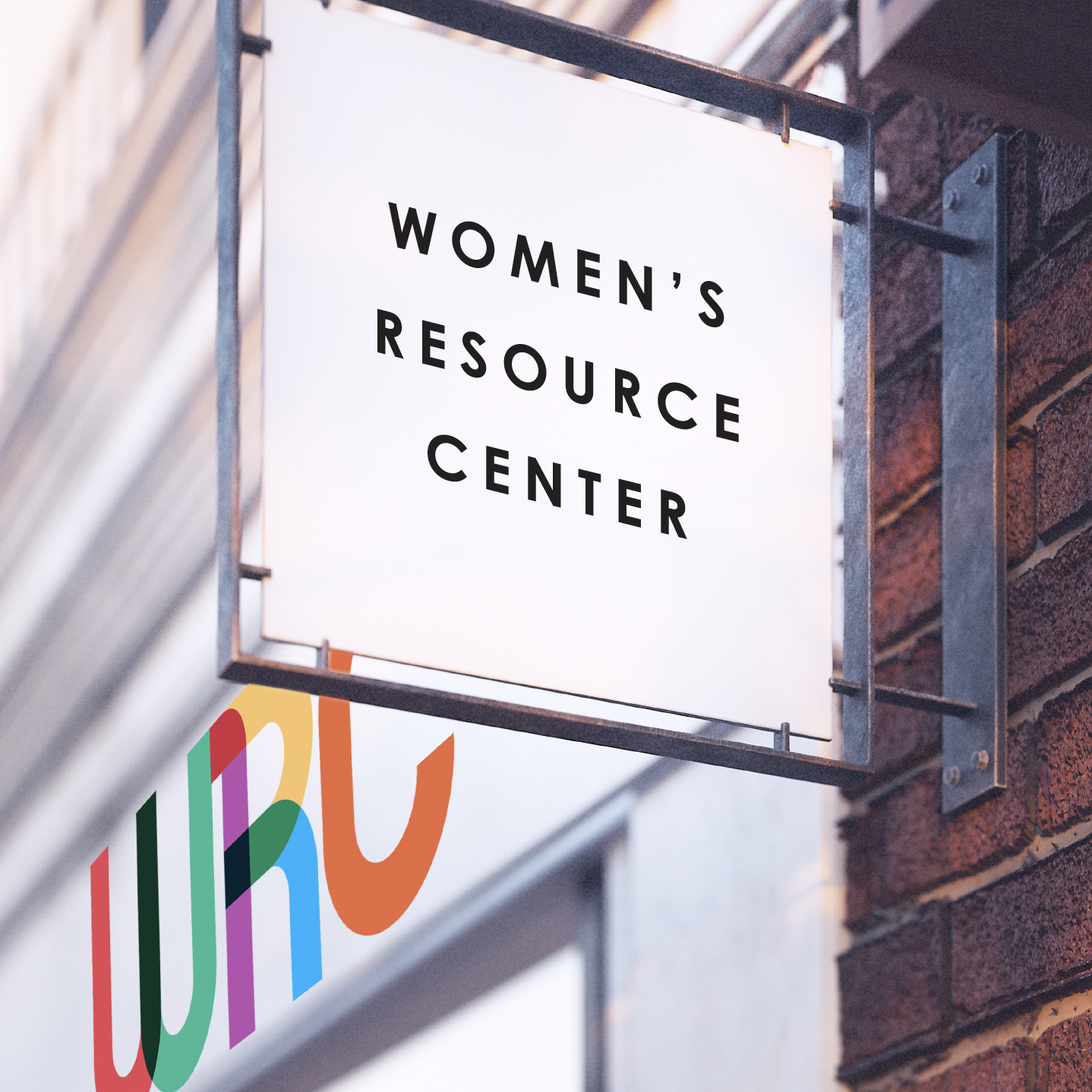
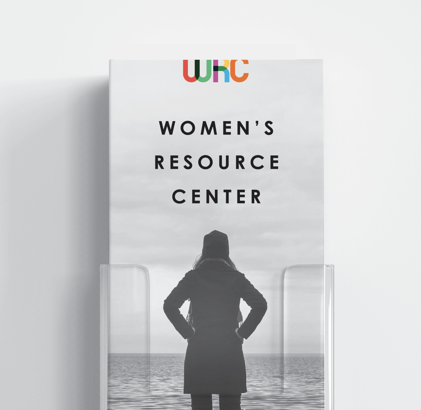
This identity was built to convey a calm confidence, stability and timelessness. The Women’s Resource Center name is typeset simply in a Bauhaus era font – a design language which unifies beauty and usefulness. The WRC emblem provides movement, adds warmth, diversity, and breathes life into the look and feel. Photography is stoic in black and white, subjects are captured authentically, never posed - with strength and hopefulness for the future.